Work faster with rapid prototyping in Procreate

Thumbnails don’t always translate well when going to final (for more info on that, read Size matters when solving design issues). I almost always have one layout that I’m rooting for. But there comes a point where I realize it just isn’t to be. It could be that specific combination of things just don’t work. Or, one portion will work well to the detriment of another. It can be a hard thing letting go, but compromising the layout is a bad strategy. This is where I’ll do some rapid prototyping in my Procreate app.
In this post, I’ll focus on my Cat Cave piece, walk you though a few options, and how I came to my conclusion.
I may do a half-dozen layouts before I come up one I’m satisfied with. As I’ve already developed most of the elements, I’m not interested in re-drawing them over and over. This is where I prefer to leverage the efficiency of Procreate.
NOTE: You can do this just as easily in Photoshop. The basic principles are the same. I happened to choose Procreate for the focus of this post as my workflow is heavily skewing towards it these days.
Here’s the thing: Don’t fall in love with your work. Your favourite layout may not be the best one to execute. We get so wrapped up in our work it’s sometimes difficult to be objective. If you have the slightest doubt about a piece, take a step back and ask yourself: “Is this the best way to go about this?”
I scanned my pencil sketch (below), and imported it into Procreate. I don’t typically start my work on the iPad or Mac. I like to work things out in my sketchbook, then refine on my light pad. It does mean a few extra steps, but I enjoy the analog part of the process too much to give it up.

From there, I make a selection of each letter and copy onto separate layers (below). Normally, I would rename each layer. In this case, however, I have a clear preview of each letter, so I bypass this step. I now have a “master” to work from. I will also multiply each layer. I want everything to be transparent, so I can easily see what’s going on.

For each of my prototype layouts, I make a duplicate from the Procreate gallery (below).

I treat the layouts as blueprints. I don’t want to be distracted by colour. I’m only concerned with the overall layout, and whether things are balanced. Colour, detail and texture will come later when we go to final.
The goal here is to work quickly—this is RAPID prototyping, not nit-picky prototyping. Don’t be concerned about line weight, if things overlap or are a bit messy. It’s supposed to be messy.
I recall one of my instructors, years ago, calling this process “Moving sh*t around.”
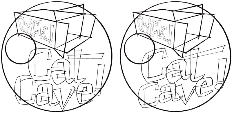
The following layouts were my initial favourites. I liked how the “Quick!” text was contained on the side of the box. However, I wasn’t comfortable with how the “cave” text was sitting on the bottom—almost saggy. Skewing the type helped somewhat, but it still didn’t feel right. The circle will contain some small text. I’m okay to leave this blank, as I know it won’t affect the overall layout.

In the layout below, I completely contained the text on the top of the box. This is where Procreate will be way more efficient than drawing or tracing. I can simply group the letters and distort them into place. Yes. I COULD re-draw that, but it’s just not an efficient use of my time. The text was too skewed to be easily legible. If I rotated the box to show the text more straight-on, then it would be hard to see the opening of the box, with the cat. I’ve also not rendered the box any further than … a box. I knew showing the flaps wouldn’t affect the overall layout, so I left them off. Again—working quickly.

The following two were my least favourite. The type for the one one on the left felt awkward, as it just hung limply above and below the box. The one on the right was a slight improvement, with the box at more of a flat angle. But it too felt compromised, so I moved on.

The layout below was where it felt like things were coming together. I let go of the lower case “a” in cat— remember, don’t fall in love with your art. I wanted to frame everything in a trapezoid, but it felt like it was unnaturally forcing things into place. The box was at a better angle, as we could see inside more easily. However, there was some odd white space around “CAT”, and that would have to be worked on.

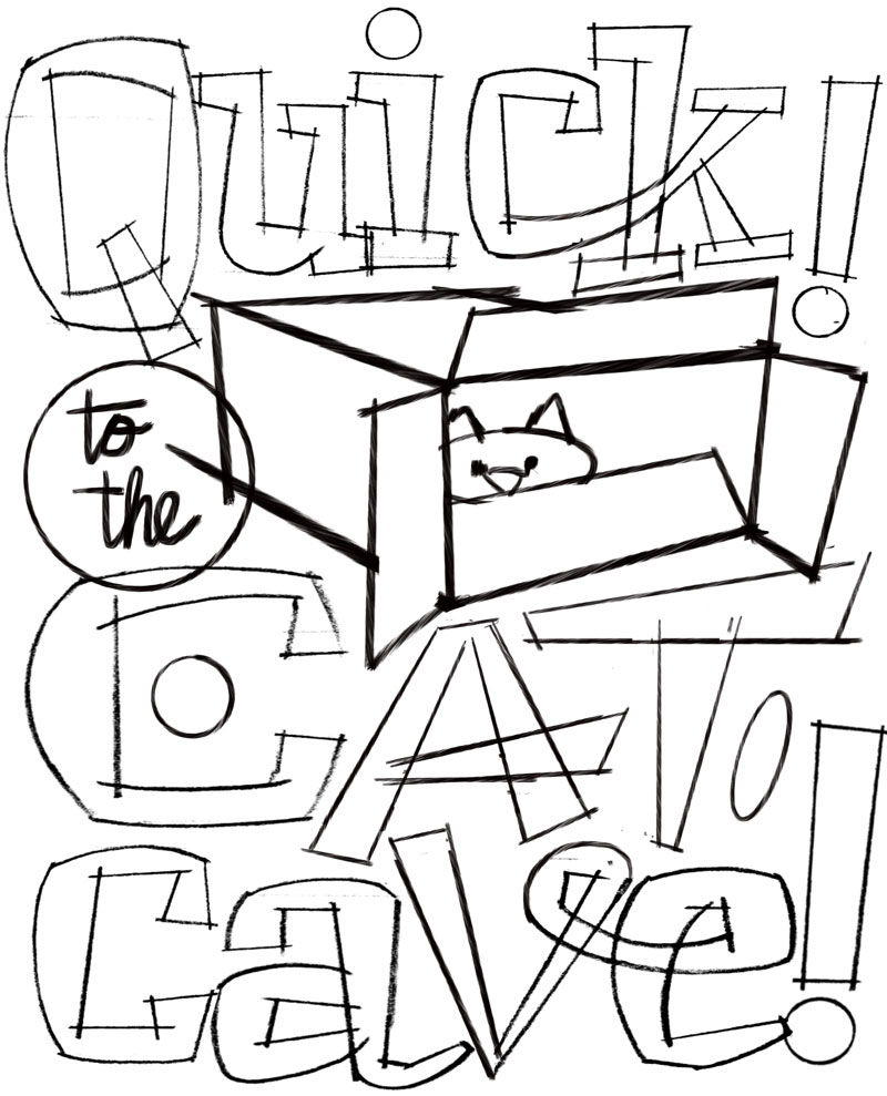
In the final layout, I dispensed with the trapezoid, and spent more time crafting the letters. I try to avoid strong horizontals and verticals, as it makes for a less dynamic layout. I prefer to let parts of letters “grow” into white spaces and gaps. You can see where the crossbar on the “A” extends into the white space of the “T”. Altering the layout also opened up some white space for me to drop in additional art. Any little spot where I can add some interest is welcome, as long as it doesn’t junk up the layout. For this, I simply draw a rough shape—a circle or ellipse—to indicate where something will go. I haven’t determined what that will be, yet. For now, a rough placeholder is okay, as it gives me a reminder that I need to drop something in. Overall, I felt this was a more balanced layout, and the text was more legible.

I encourage you to incorporate prototyping in your workflow. You’ll be less likely to “settle” on a particular design, and you’ll get a better, more balanced layout. Plus, you’ll be more efficient. And efficient is good.
