Printing Your Lettering And Illustrations Part 2: ICC Profiles

In my previous post, I talked about creating an accurate display profile. If you’re still using a generic profile, then all the lettering and illustration artwork you see on your monitor will just be an approximation.
Your monitor will have one ICC profile. Printers, however, can have many different profiles, depending on the printer manufacturer, and the type of ink and paper used. Reputable paper manufacturers (Ilford, Hahnemühle, Red River, Canson, etc …) create custom profiles for each of their papers matched to a specific printer model. “Generic” papers from the office supply store typically don’t have custom ICC profiles.
This isn’t meant to be an in-depth, technical guide to ICC profiles. There are tons of resources on the interweb that go into far greater detail on how they’re designed. My goal here is to get you up and running quickly.
I would also recommend sticking with OEM inks. Yes, they’ll be more expensive, but they’re designed to be consistent. The quality control on refilled cartridges may vary from batch to batch, making it difficult to get accurate colour control.
Installing ICC profiles
Installing a profile is straightforward. There should be download info included with the paper documentation, or you can go directly to the manufacturers site.
Mac
- Download your ICC profile. Unzip if necessary.
- Move the profile to: Library > Colorsync > Profiles.
PC
- Download your ICC profile. Unzip if necessary.
- Right click on the profile (it will have an .ICC or .ICM extension) and select “Install Profile”.
You should now see the new profile in your print dialog.
Soft Proofing
I’ll be using Photoshop for this explanation.
Soft-proofing, using a proper ICC profile, will more accurately predict what your illustration will look like when printed.
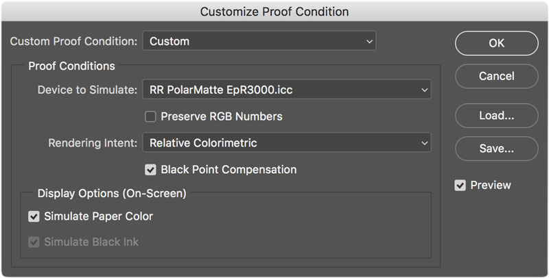
Open the artwork you want to print. Go to: View > Proof Setup > Custom. Choose the profile you want to use. The dialog box below is for MacOS High Sierra, and the ICC profile is for Red River Polar Matte paper.

I don’t usually soft proof when I’m working on an illustration, as I know my monitor is properly calibrated. Plus, my output is mostly for the web. I use it as a final “disaster-check” before going to print. Try toggling Simulate Paper Color on and off. You may notice the whites in your illustration go slightly grey. This is the ICC profile doing its best to simulate the paper colour. The difference between paper color on and off is usually pretty small.
The settings in the dialog box above are what I typically default to. Under Rendering Intent, try toggling between Perceptual and Relative Colormetric. This tells Photoshop how to deal with out of gamut colours. In my experience, I haven’t seen much of a change when I toggle between the two.
BTW, changing any of these settings will not edit your image. Hence, “soft proofing”.
To toggle the soft-proofing on and off, press CMD-Y (Mac) or CTRL-Y (PC).
Printing
Once you get into print settings, each operating system and printer driver will have different menus and options. Follow the settings as recommended by your paper manufacturer.
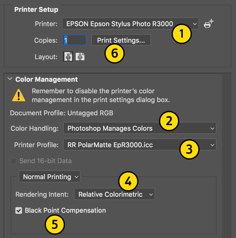
In the image below, I’m using settings as recommended by Red River for their Polar Matte paper.

To start printing, press CMD-P (Mac) or CTRL-P (PC).
- Choose your printer.
- For Color Handling, select Photoshop Manages Colors. This is the same as disabling your printers built-in colour management.
- For Printer Profile, choose the ICC profile you wish to use. It should be the same one you’re using for soft-proofing.
- Rendering Intent: I use Relative Colormetric, as that’s what Red River recommends. The instructions for your particular paper may be different.
- Black Point Compensation: I turn on as that’s what Red River recommends. The instructions for your particular paper may be different.
- Click Print Settings when you’re finished configuring 1-5.
The Print Settings dialog box will open. Choose your paper size, paper handling, media type, etc … Your configuration may be different. Refer to your printers documentation on how to set up these parameters.
The big takeaway here is you want Photoshop to take over the colour management.
Typically, it will say something like:
- Color Matching: Off
- Off (No Color Adjustment)
- None
- Application Managed Colors
It may also simply be greyed out. In the menu below, under Color Matching (Epson running MacOS High Sierra) ColorSync is selected, but there are no settings here I can change. This is because I selected Photoshop Manages Colors in the Print dialog box.

The documentation for your particular paper should have instructions on how to bypass your printers built-in colour management.
Look for the quality setting of your printer, and make sure it’s set to highest. Epson calls theirs “Superfine”. Others will list it as “High”, “Best” or “Photo”. If there’s a high-speed, or “ink-saver” setting, turn this off.
To recap so far …
- Calibrate your monitor.
- Install the appropriate ICC profile for your printer and paper.
- Soft-proof your artwork.
- Disable your printers built-in colour management before printing.
Find a good paper you like and start printing. Red River has sampler packs you can try out if you’re not sure where to start.
In the next post, I’ll talk about correct lighting.
