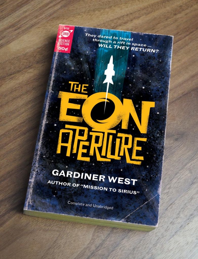
Tutorial: Create a Retro Sci-Fi Paperback Book Cover

Using the RetroSupply Turbo Textures Brush Kit and Paper Artifacts Bundle, we can create an old, worn book that wouldn’t look out of place on a cottage shelf or in a used book store.
1. Research and Sketch
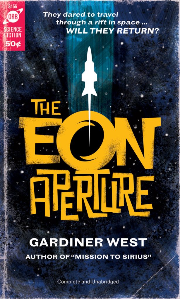
There’s something in my DNA where I have to do a space travel or sci-fi piece every so often. In this case, I had in mind a 1960s sci-fi paperback book cover, with a distressed type title.
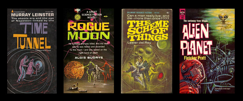
For my cover, the story goes that the brave (or foolhardy) crew of a starship traveled through a rift into another dimension. Coming up with the idea was as much fun as doing the artwork!
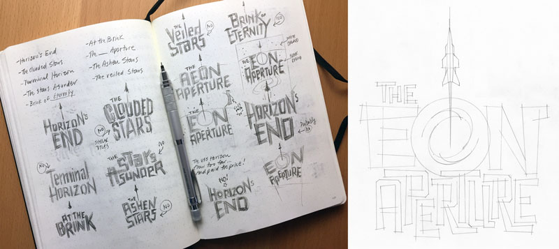
As always, the project starts as thumbnails in my sketchbook. You can see where I discarded a bunch of titles. Turns out they had already been used, or were too close to others. Once I had my chosen design, I sized things up and refined the details. I’m still working analog at this point.
For the “build” portion of the project, we’ll work in two stages. The first will be building out the vector elements in Illustrator. The second will be completing the colors and textures in Photoshop.
2. Scan your sketch and adjust levels
I prefer to use a flatbed scanner, as I know the sketch will be distortion free. If you use a phone to photograph your sketch, turn on the grid lines to help line things up. Adding a light, pencil frame around your sketch will help.

Open your image in Photoshop, and go to Image > Adjustments > Levels (Mac: CMD-L , PC: CTRL-L). The range starts with pure black on the left, midtones in the middle, and pure white on the right. Adjust each of the triangle sliders to reduce the greyness of the paper, and make the lines nice and dark. Save your file.
3. Build working file in Illustrator
Import your sketch into Illustrator, and scale to your desired size. The image will be placed on a new layer. Rename the layer, if you wish. Here, I renamed it “template”.
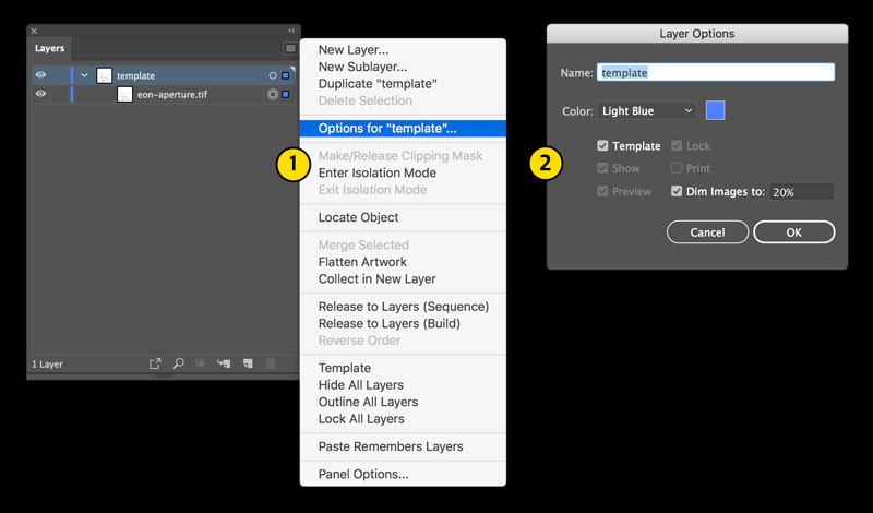
Create a template layer
- Click the sub-menu on your artwork layer (the little hamburger at the top right of the palette), and select Options for “template”… (“template” being the name of your layer which has your scan).
- In the Layer Options pop-up menu, select Template. Enter a value in the Dim Images to: I like to use 20%, as it’s just dark enough to trace over.

Draw your shapes
- Create a new layer, and use the pen and shape tools with a thin stroke to trace over the template. Feel free to overlap as we’ll be merging these shapes later. Use as many layers as you feel necessary to keep things organized. NAME YOUR LAYERS!
- When you feel you’re done, select the shapes you want to merge. Go to Window > Pathfinder (Mac: CMD-SHIFT-F9, PC: CTRL-SHIFT-F9), and select Unite at the upper left.
- The selected shapes will be merged into one. Unite your shapes selectively. Selecting all the shapes in your layout will merge them all into one shape.
I prefer to work in greys in Illustrator. It helps me focus on the balance and layout. If you wish to drop in colors at this point, then feel free to do so.
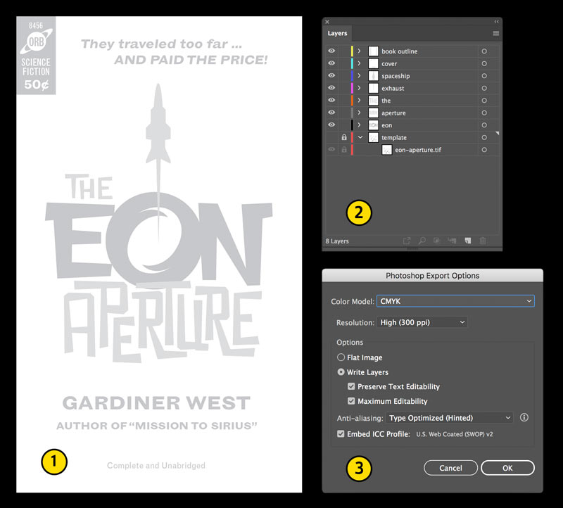
Add details and export
- Add some publishing details, such as the publisher, price, and tagline. The typeface I used here is Grotesque MT.
- Organize your layers, if necessary.
- Go to File > Export > Export As … and under Format choose Photoshop (psd). Click Exportand save the file. In the Photoshop Export Options dialog box, select CMYK and Write Layers. Save your file.
4. Build file in Photoshop
Open the exported file in Photoshop. Some layers may be named things like “<Group>” or “<Rectangle> “. This is how Illustrator names some of the elements on export. Edit the layer names and re-arrange them, if necessary. I prefer to organize layers from top to bottom (ie. elements at the top of the layout will be at the top of my layers). You can also group layers into folders for added organization. As with Illustrator—NAME YOUR LAYERS!

Here’s my non-destructive process to add color to the grey elements from Illustrator. (NOTE: If you’ve already added color in Illustrator, then you can skip this step. You can, however, still change your colors using this method). Select the layer you want to edit, and double-click. Be sure to click within the empty area to the right of the layer name. A Layer Style dialog box will open. Select Color Overlay in the column to the left. Leave the blend mode as Normal, and click within the color square to the right, and select your color.

For the spacey background, I built up several layers with a gouache brush, and kept it deliberately unrefined. I’ve isolated a few layers above so you have an idea.
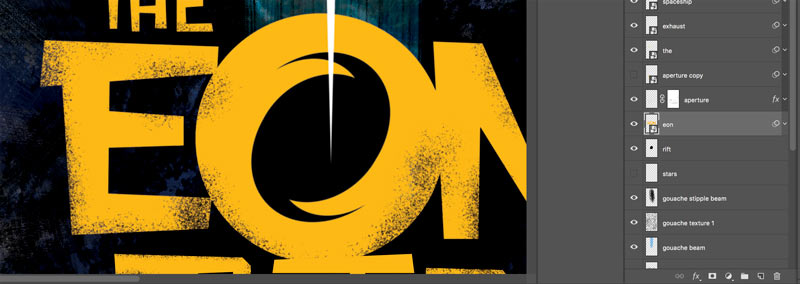
For the title, I added a layer mask, and used Turbo Textures Brush No. 19 to roughen things up. I didn’t want to obliterate the edges, but just add some texture to make it look less pristine.
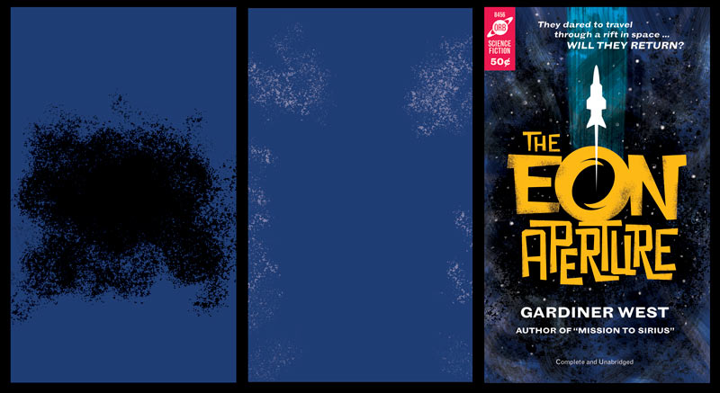
As a final step for the background, I added some additional texture layers. I’ve isolated a few of the layers above. On the left I used Turbo Textures Brush No. 4 to add some shadow behind the title. The center image uses Turbo Textures Brush No. 11. set to white at 50% opacity.On the right is the almost complete cover.
To complete the background, I used my gouache brush and added a layer with stars.
To give the cover an authentic, used feel, I used RetroSupply’s Paper Artifacts Bundle.
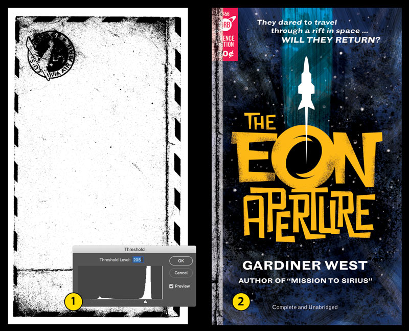
- I found a good crease in the envelope image (RSCO-Artifact011.jpg). Go to Image > Adjustments > Threshold…and adjust the level until the image becomes very contrasty. Select a crease (M) and copy.
- Paste the crease back into your artwork. It will be placed onto a new layer. Position, rotate, and size the crease. In this case, it’s going along the left side to show many years of buffing and folding. Go to Image > Adjustments > Invert (Mac: CMD- I, PC: CTRL-SHIFT-I). Set the blending mode at the top of the layers panel to Screen and adjust the opacity as necessary.
Use a Mask Layer to selectively erase portions of the buffing. This will help reduce repetition in the texture. Use the same method to add more buffing and creases. For the top, right and bottom I used the edges from RSCO-Artifact23.jpg.
As a final step, I added a slight blur to the title and publishing info. Left as is, they’re a bit too sharp. To add an un-destructive blur, go to Layer > Smart Objects > Convert to Smart Object. Then go to Filter > Blur > Gaussian Blur … and adjust the pixel radius to your taste. I used a 1px radius here. If you want to edit the amount of blur in the future, simply double-click Gaussian Blur under the layer name.
Here’s the completed cover, in all its battered glory.
5. Bonus step
To create a mock-up of your cover, follow the steps below.
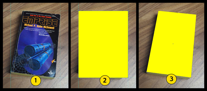

- Photograph an old paperback. Position some guides so they touch the corners of the cover.
- Select the rectangle tool (U) and draw a shape to the edges of the guides you created in the first step. Pick a color that will give you good visibility against the background. Go to Layer > Smart Objects > Convert to Smart Object. Hit Enter.
- Turn the guides off. Go to Edit > Free Transform (Mac: CMD-T, PC: CTRL-T). Hold down CMD (PC: CTRL) to select each corner point, and drag the shape into position on the cover. Hit Enter when complete.
- Double-click the Smart Object you just created. This will open a separate Smart Object (.psb) file.
- Go to File > Place Embedded … and select your cover artwork.
- Resize the art to cover the background. Don’t worry if it looks distorted. Press Enter. Save the file.
Go back to your original file. Done!
