My Precious Step-by-Step

This is a laid back look at how I approached my My Precious (that sounds funny) illustration. This isn’t a technical overview, so much as my thought process as I worked through the concept.
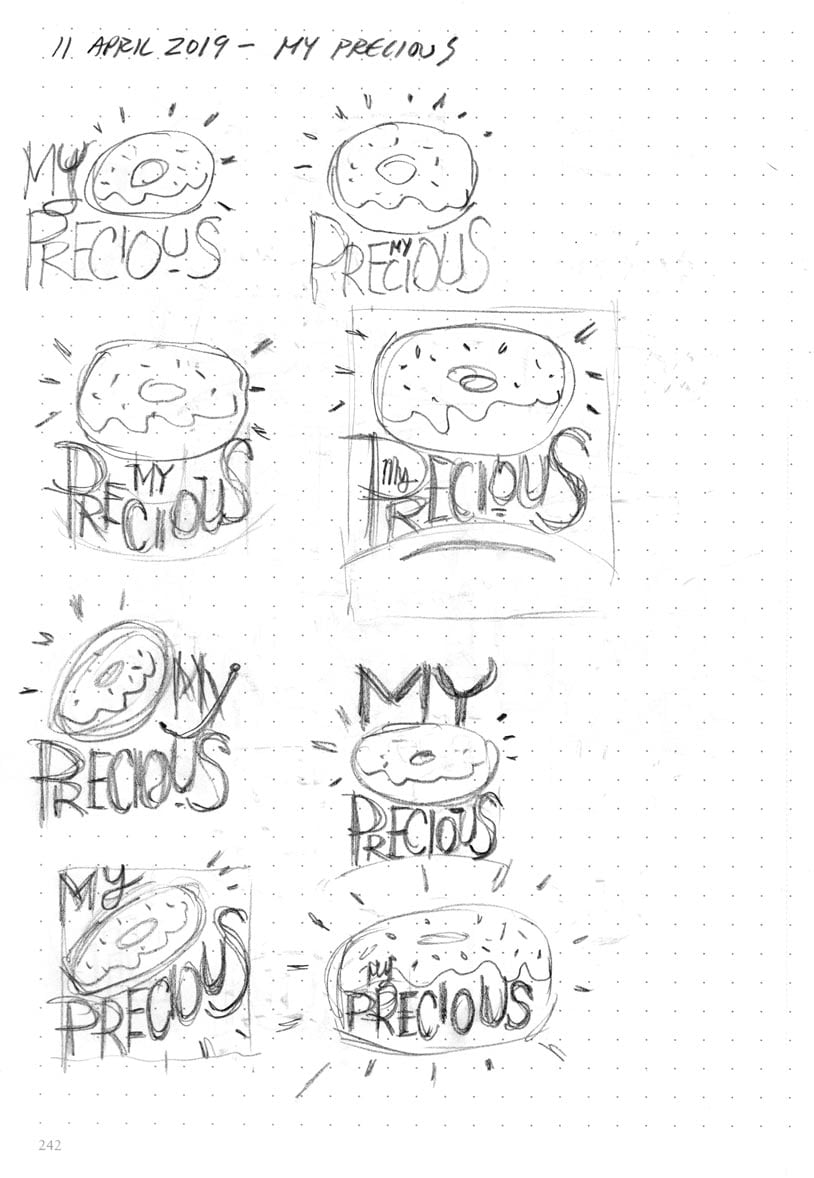
As with most pieces, I had a rough idea in my head for the layout. In the image below, my sketches are basically glorified thumbnails. I’m taking the basic elements and moving them around, trying different angles, putting the lettering inside shapes, etc … I’m looking for a good balance between the lettering and the donut (or doughnut, depending on where you’re from).
Struggle #1
I thought I had a clever, original idea. I was working on my sketches, then thought I’d better see if anyone else had done it.
Yup. Lots of people did.
As it turns out, the idea was a somewhat popular meme. Dagnabbit. “My” idea went up in a puff of smoke. I stopped developing the sketches.
However, I couldn’t get the idea out of my head. I knew the idea wasn’t original. The thing is, it hadn’t been done by me. So I thought, screw it. I’m going to do it anyway.
Moving forward
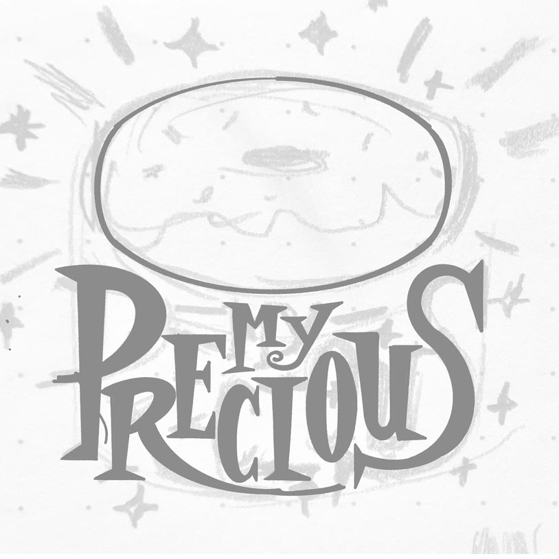
In the image below, I started crafting the look of the lettering a bit more. I wanted a lord-of-the-rings-ish look, but not too closely. That would be derivative. I was going after a slightly medieval look with a bit of retro styling. You can also see where I wrote “Stop. It’s been done.”

Struggle #2
I was confident I had the right layout. I scanned the sketch (image above, bottom right) and imported it into my Procreate app. After developing the layout for a bit, things seemed off. I find this happens quite often when moving from a sketch to the final. The sketch has an energy that the final doesn’t. I could have pushed forward, and kept developing that sketch until I was satisfied. However, I just wasn’t feeling it with this one.

This is where I find the greatest friction when I’m working on an illustration. I have an idea in my head that doesn’t translate to paper exactly the way I imagined it. It happens, to a degree, with all my work. Sometimes the transition to final is pretty seamless. This time, the translation was … less than optimal.
Because this was a personal project, I was free to persue whatever direction I wanted. Had this been a client job, I would be constrained by whatever project parameters had been established between myself and the client.
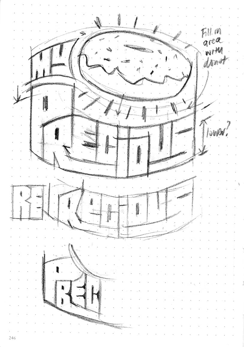
At this point, I did a complete reboot on the concept, and went back to the drawing board (or sketchbook, in this case). If I’m going to change things up, I going to really change things up. I dropped the “gothic” look, and went for more of a groovy 60s or 70s look.
I mashed the letters together, and started building them as a single piece, with elements inter-locking together. In some ways, it reminded me of the type on the side of The Mystery Machine from Scooby Doo.


Struggle #3 (sort of)
I now had my pencil linear figured out. While waiting for my car at the dealer’s service shop, I did the final art in Procreate on my iPad.
Here’s the final …

After all this, I’ll admit that this is not one of my favourite illustrations.
I totally get curating your best work. However, I think it’s important to share the things that didn’t go so well.
Despite re-working the concept, the final still looked awkward, to me. It’s not the most legible, and I never really figured out the top part of the “P” (that gap still bugs me). But damn it, I was going to finish it, if for no other reason than to write this blog post about it.

