Illustration Step-By-Step: Cow Abducted By UFO

I figured it was about time for another Step-By-Step Illustration post.
I always look for an excuse to do an alien or space themed piece. At the time of this writing, my home page has four alien themed pieces. There’s always room for one more.
Like my other work, it’s light hearted and whimsical. I’m sure that’s not the case for the poor cow (if you believe that sort of thing).
Typically, I don’t limit myself in the use of brushes or colours. My usual output is either a print or simply posted online. I took a different approach with this piece, and I designed it to go on a t-shirt. I kept things simple—that meant flat colours and a limited palette.
Sketching Phase
When I start my thumbnails (below), they are as rough as rough can be. I’m not concerned with how exactly everything will fit. This is the view from 40,000 feet. I’m quickly going through various iterations. It’s basically a skeleton. I’ll try stacking the words in different ways, mix-up upper and lower case, and introduce a few rough shapes. I’ve also not 100% finalized the words, so a few different options appear here.

As I worked through my initial thoughts, I steered the overall layout to something less vertical (below). As it’s going on a shirt, I don’t want it too skinny. I explored a few circular options but quickly discarded them as they didn’t feel as legible. The thumbnail with the asterisk made me go “yeah, that’s the one.” It still needs finessing, but the general layout feels right.
In this mix I’m also jotting down some random ideas. I do this now because I’ll probably forget my idea later. Like Field Notes says, “I’m not writing it down to remember it later, I’m writing it down to remember it now.”

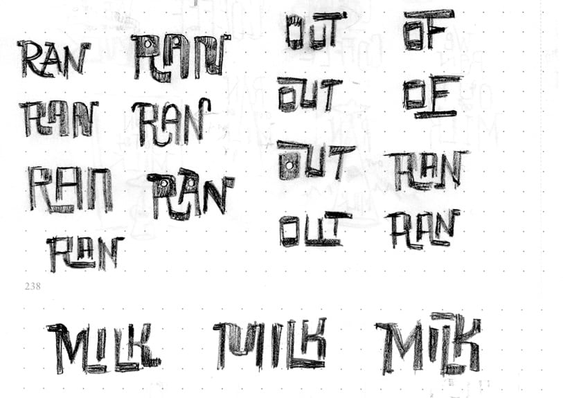
Now that I have a good grasp on the general layout, I’m playing around with individual letters and pairs (below). I’m not sketching the layout as a whole, but just getting a feel for the style. I’ll run through different combinations of letters to see how they can fit together. I’m also exploring a few different styles. Could they be sharp edged? Rounded? A bit of both?

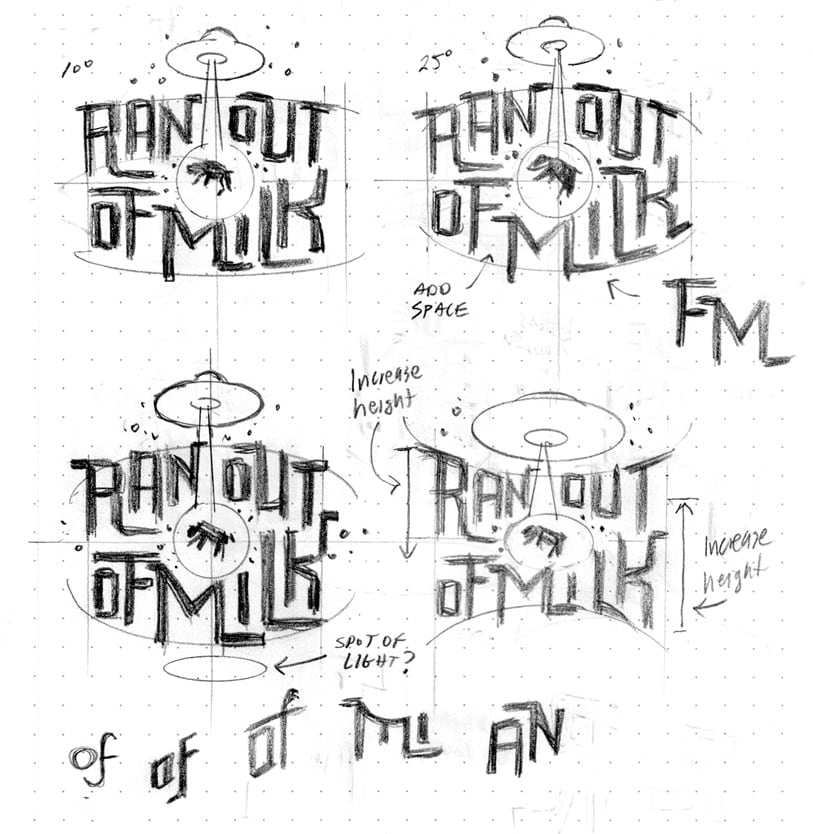
This is where I start to sketch the layout in it’s entirety (below). It’s still really rough, but I’m paying more attention to how things fit and the overall balance. I’m still jotting down some alternate lettering pairings and making notes (ie. “increase height”).

Many times I’ll go back to an original thumbnail as a reality check (below). I liked that my chosen layout felt readable and jaunty, but I always have that lingering feeling that there could be a better option. I’ll reach back to one of my original thumbnails and see if it’s viable.
In the end, I still felt the stacked text felt too vertical. Had this been a print I very well could have gone in this direction.
The “Need cream for coffee” made one last appearance. I’m also giving more thought to some of the lettering detail—a faux emboss, in this case.

Here’s the last page of thumbnails (below) before I started working on the final.
Not everything has been figured out. The poor cow has basically been a blob, so far. That’s okay, as its overall shape is a known factor and won’t really impact the layout.

Ironically, I picked that rough thumbnail to do my final (below). There was something about the energy of that sketch. I took a photo with my phone and opened the image in Photoshop. I did the same thing with one of the flying saucer sketches and positioned it on a new layer.
It’s pretty darned rough considering how much it’s enlarged from the original. That’s ok, as it’s now at a comfortable size for developing the linear. I wrote about working larger here.

Linear Phase
Moving on in our step-by-step illustration, I’ve moved over to my light pad (below). I slid the sketch below a fresh sheet of laser paper. I’ve drawn a light grid with my rolling parallel ruler. I haven’t evenly spaced out the grid lines—this is just a quick guide to keep me on track.

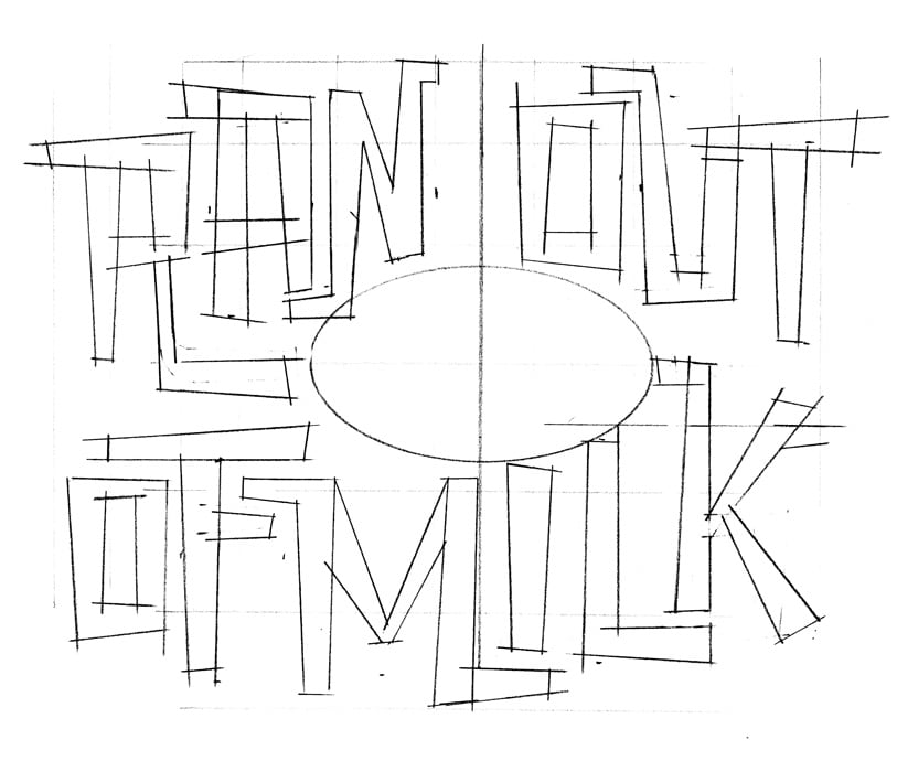
There’s not really a coherent shape to trace (below). I’m looking at the overall shapes, and referring back to my sketchbook. With my Blackwing and set square, I draw in the edges of the letters. At this point I haven’t decided if the letters would be made up of straight lines only.

Once I have my linear, I make a copy and write some notes (below). I’m looking at things like spacing, size, and how things are lined up. Basically, anything that looks out of whack.

Final Art Phase
I import this sketch to my Procreate app to use as a template, and work on the final art (below).

As I mentioned earlier, I hadn’t worked out the look of the cow. I did this directly in Procreate, along with the levitation “beam”.
However …
Something about the beam was bothering me. I like that the lettering wrapped around it, but it could be misinterpreted. Was it a levitating beam or was it disintegrating the cow? I decided to do a mid-course correction and bring it in line with the look more commonly seen in popular culture. This is an important distinction when evaluating things—don’t fall in love with your work. Make sure your artwork will be easily understood.

Working in the different beam shape meant I had to re-jig the letters. This also helped the layout, as it let me fill in some gaps. The difference in the size of some of the lettering gave the layout more visual contrast.
I also played around with the colours, and simplified things by removing the bottom of the flying saucer. The shape is implied, plus it made things feel a bit more dramatic. I also removed the faux emboss. I preferred the more graphic look of the lettering without it.
There’s also an intangible here, and one that comes with experience. It’s important to be analytical and objective about evaluating your artwork. However, a large part of the work is emotional. How you “feel” about the stuff you’re working on. It’s difficult to explain, but the closest I can come to is a “Eureka!” moment. This is where, objectively, the layout is structured properly, and can be easily interpreted
I hope you enjoyed this step-by-step illustration piece. You can see it’s not always a predictable path from idea to final art.
Links in this post
Size matters when solving design issues
Review: Palomino Blackwing Pencil
