Creating a concise layout that people understand

Getting beyond things like developing a colour palette, or choosing brushes, is developing a concise layout that your viewers will understand.
I don’t normally start my design process on the iPad. I still prefer to push a pencil around on paper when I’m working up my initial concepts. I don’t want to fiddle around with colours, layers or brushes. I want to get my thoughts down as quickly as possible. When I use my sketchbook, the most I need to do is click my mechanical pencil for more lead, and turn a page.
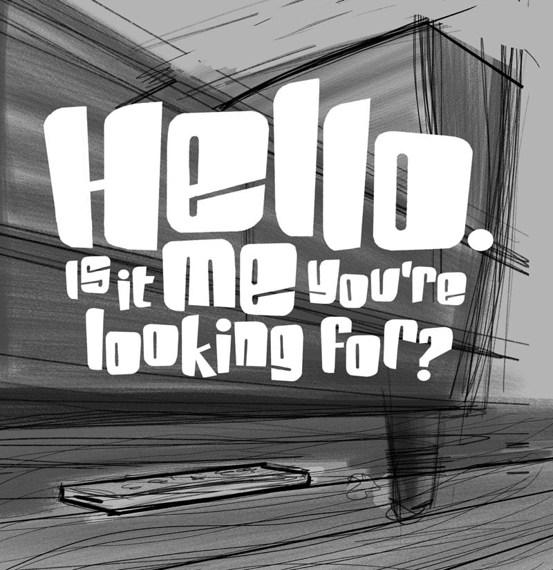
However, for this one I just dove right in to Procreate. In a similar fashion to my cat cave rapid prototyping, I did a series of very fast sketches. These were “proofs of concept”. Because the visual depended heavily on a certain viewpoint, I had to make sure it would make sense to the viewer.
I wanted the lettering to exude a certain coolness, but maintain that 1980s eccentricity. I used a rounded rectangle as the basic shape for each letter, then strategically “cut-in” to form the letters.

Hello 1
My initial idea used a set of lost keys. I switched this to a TV remote as it seemed more familiar—and fun. I’m pretty sure our Apple TV remote phases into another dimension entirely.
My first sketch showed the remote front and centre. The view was from under a sofa and towards the TV.
I had a few issues with this: Did it look too much like a gigantic remote sitting in front of the TV? Would the viewer know the top half—where the lettering was positioned—was the underside of the sofa? It also focused too much on the TV stand gear.
This is a good example of something that made sense in my head, but it may not make sense for everyone else. It wasn’t a concise layout.
I really wanted to like this one. But what we like isn’t always right.
So scratch this one.

Hello 2
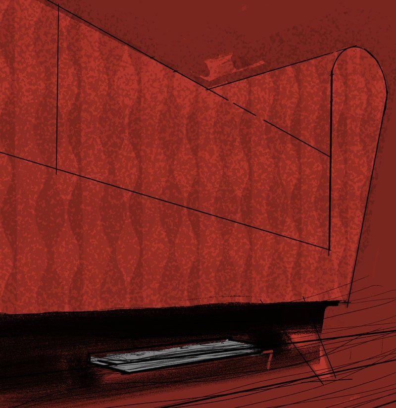
I switched the point of view to focus back towards the sofa. I liked that it kept good separation of the elements. The “sofa” looked a bit too abstract. Was it a sofa? A chair? An ottoman? It was also lacking a bit of interest on top. It just felt bland.
Also, the remote felt like it was fading into the background.
Moving on.

Hello 3
I introduced more structure to the sofa. Because I needed more height on top, the proportion was getting too vertical for my liking. I repositioned the lettering on top of the sofa. However, it felt like it was covering up too much, and the sofa still felt a bit abstract.
On to #4.

Hello 4
This was essentially the same as #3, except I cropped most of the floor, and distorted the lettering to fit a square frame.
It felt more balanced, as it focussed more on the remote. The lettering covering up the sofa was still bugging me, though.
Next!

Hello 5
I decided to concentrate more on the sofa. I played around with the shapes and some patterns. I wasn’t loving it, though. The rounded armrest didn’t feel right. It was losing the energy the version with the straight lines had.
Queue up #6.

Hello 6
I went back to my earlier, squared-off sofa (now a chair).
I wanted to have the lettering big and bold, but I also wanted to clearly show the sofa. I was getting a bit frustrated at this point.
I introduced some white lines to mimic the shape of the chair. I was trying for a deconstructed mid-century look. In the end, it felt like there was too much going on, so I dropped it.
This is where I started developing the “balloon” graphic. It could be used to contain the lettering, and mimic the angles of the sofa. While the shape had a good energy, it was still covering up too much of the sofa.

The Final
The final struck a balance between showcasing the lettering, and showing enough of the sofa.
Encasing the lettering in an outlined ellipse helped show more of the chair. Plus, the shape was different enough from the straight lines of the chair that it didn’t interfere as much.
I normally like to make the lettering play a more prominent role in my artwork. For this piece, I had to strike a balance.
Going back to the angular chair meant I could use the armrest as a point of interest. The mug helped highlight—literally—the play of light coming off the TV. I also worked the shadows in on the chair legs and remote control.
I worked with darker tones and reds to play up the mellowness.
Final thoughts
I futzed around a lot with this one. I’m showing you the seven versions as I saved them. What you don’t see here were the many steps in each one, where I added layers, drew, erased, deleted layers, etc … There comes a point where you just have to put it out there. However, make sure you have a concise layout.
Being perfect isn’t efficient.
