Case Study: Rusty Staub

My childhood hero, baseball player Rusty Staub, passed away in March 2018.
I knew right away I wanted to create a piece in honour of him. I like to work on pieces that are personally moving, and that draw upon my personal experiences. I think it makes for a more impactful piece.
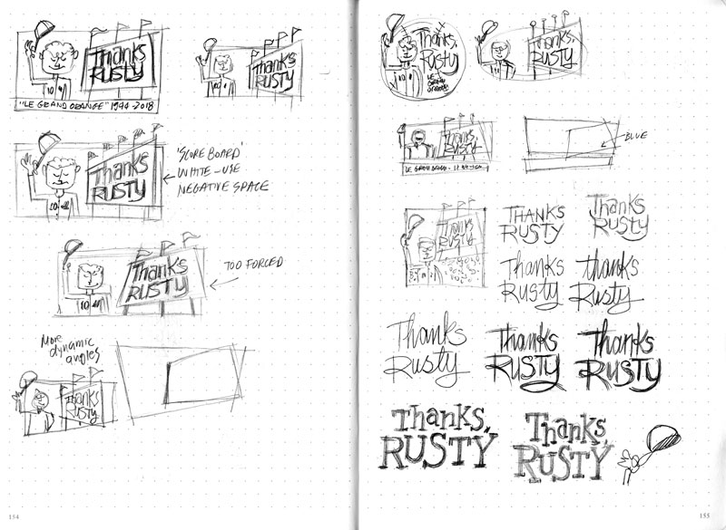
By the time I got to my sketchbook, I had a few ideas rattling around in my head, so I wasn’t sitting down cold. Like any new concept, they’re pretty rough to start. At this point I’m dumping the images I have in my head onto paper. At this early stage, I’m simply getting them out of the way, as I know my first ideas are not usually my best.
I knew I wanted Rusty to be tipping his hat to the crowd. My initial ideas (below) had him facing away so you could see his name on his jersey. I quickly moved away from this, as it made him feel impersonal. On the left page I’m roughly blocking in Rusty with the text, and giving some thought on the proportions.

I had a rough idea of how the lettering would work, but wasn’t too worried about the details. I wasn’t trying to replicate any particular style of the time—just what felt right. I wanted something very simple.
As we move to the right hand page, I’m still working out the placement of the elements. My first thoughts felt a bit basic, so I started working in some baseball nomenclature. The scoreboard seemed a good way to contain the text, without getting too busy. The flags were a throwback to Jarry Park, where the Montreal Expos first started playing. They added a celebratory feel, which was appropriate.
I’m also doing some research on the uniform, and on Rusty as well. I know it’s a somewhat loose, whimsical piece, but it’s still important for me to get the details correct.
By this point, I’ve pretty much decided on the scoreboard concept (below). I’m now exploring different ways of putting it all together: horizontal, skewed angles, round, etc … I will add notes as I move along, just so I don’t forget what I was thinking at the time (which happens).

On the right page, I start giving more thought on the type. Initially I had something more scriptish in mind, but felt a stronger, serif-type would be a better fit. I still wanted a jaunty, somewhat fun feel, so I juxtaposed the letters and exaggerated some of the features.
On the last spread (below), I’m exploring a few more layout options …

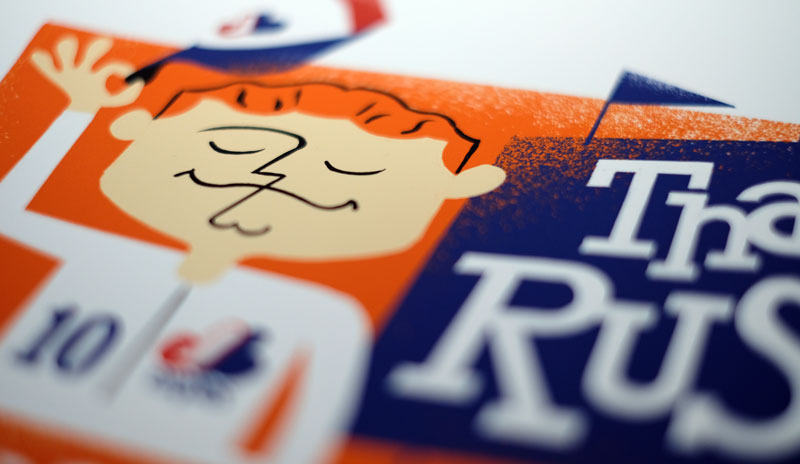
On the last page, I zeroed in on Rusty himself, and details like the face, body and hands. I am by no means a caricature artist, but it was still important to me to capture the “essence” of Rusty. I wanted his expression to be one of happy gratitude. I hope I accomplished that.
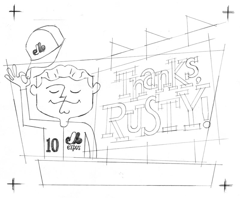
As a final step, I’ll scan (or photograph) each “select” from my sketchbook and print them at larger sizes. I use these pieces to trace and refine the layout using my light box. It’s far easier to work with larger components when fine-tuning. I go through this process several times before I come to a final composite (below). This is where I import the sketch into Procreate on my iPad Pro.
The one component of the layout I didn’t sketch was the “Le Grande Orange 1944-2018”. I thought I would simply do this freehand on the final art, but wasn’t happy with the result. As it happened, I drew out each letter directly in Procreate. I find I’m better at drawing letters than writing them.
Here’s the final, with the “deconstructed” baseball stadium …

